
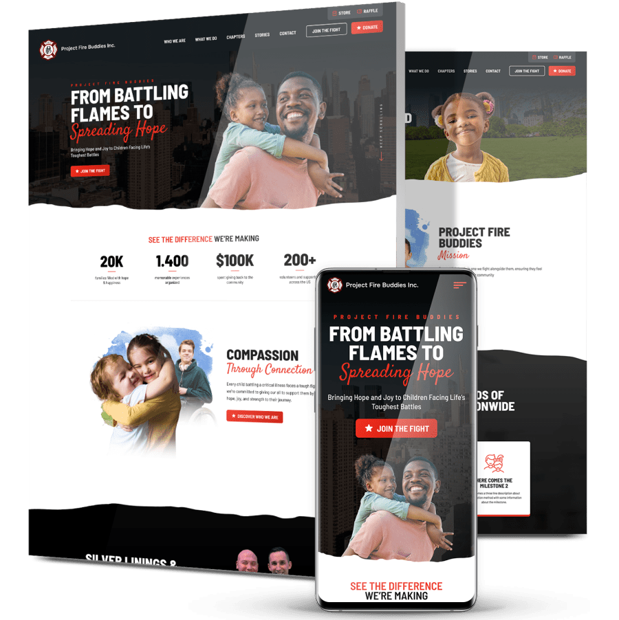
Project Fire Buddies
Spreading Hope: A Digital Platform That Turns Compassion Into Action
-
Project Fire Buddies, a nonprofit founded by firefighters, needed a digital platform that could scale nationally, build emotional resonance and drive donations.
-
We delivered a custom, mobile-first website with ADA-compliant UX, powerful storytelling and SEO-driven content to increase reach and engagement.
-
In just three months, the new platform boosted engagement time by +16.2%, grew user engagement events by +37.4% and improved organic search sessions by +2.9%.

The Challenge
Project Fire Buddies was growing across the U.S., but its web desgin wasn’t keeping pace. The nonprofit needed a modern platform that could communicate its mission and inspire meaningful engagement.
Low Engagement & Short Sessions
Visitors spent under 1 minute on the site and viewed fewer than two pages per session, signaling a disconnect between content, UX and user expectations.
Limited Organic Reach
Most traffic came from social or direct sources, with minimal search engine visibility, limiting the organization’s ability to attract new supporters and referrals.
Outdated, Friction-Filled Mobile Experience
With over 80% of traffic coming from mobile devices, the outdated design created high friction and poor accessibility for the majority of visitors.
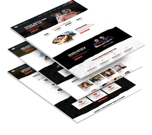

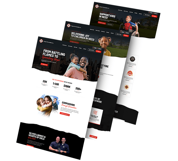
The Solution
We designed a heartfelt, conversion-focused experience that combined emotional storytelling,
mobile usability and a strategic SEO framework to drive awareness and action.
mobile usability and a strategic SEO framework to drive awareness and action.
-
Story-First Visual Design
We brought real stories, testimonials and imagery to the forefront, creating an emotional connection that aligned with the nonprofit’s mission and values. -
Mobile-First, ADA-Compliant UX
The site was rebuilt for mobile accessibility, inclusive interaction and seamless navigation to support user needs across all devices and abilities. -
Conversion & SEO Optimization
Key CTAs like “Donate,” “Refer a Child” and “Start a Chapter” were strategically placed and supported by optimized content structure. This can improve search engine visibility, boost user engagement and support long-term marketing strategies.
The Results
In the first 90 days after launch (Feb 6 – May 6, 2025), Project Fire Buddies’ new website began delivering measurable impact through stronger engagement, improved SEO performance and deeper user interaction.
-
Increase in avg. engagement
time per user by16.2%Visitors stayed longer, signaling deeper connection with the content -
Increase in user
engagement events by37.4%Shows stronger interaction and
scroll activity site-wide -
Organic + Direct
Traffic Increased by3.8%Stronger search visibility (+2.9%) and direct engagement (+4.8%) despite a 4.6% drop in overall users -
Chapters & Mission
Pages leading engagement13.3KHomepage and “Chapters” content
generated the most user interest
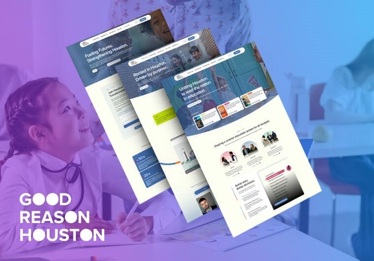
Public Education UX For Good Reason Houston
Good Reason Houston’s custom WordPress platform turns complex public education data into a clearer digital resource for policymakers, parents, educators and philanthropic partners.
Our team rebuilt the information architecture around audience-specific journeys, added Tableau data visualization for student success indicators and created a mega menu that helps each visitor group find relevant content faster.
Gutenberg blocks, Advanced Custom Fields, donation integration and JazzHR support give the nonprofit a flexible platform for advocacy, engagement and ongoing content growth.
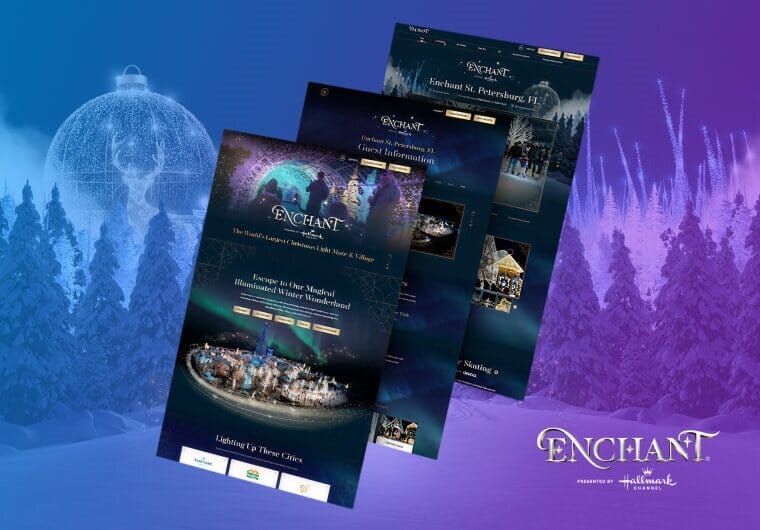
Enchant Christmas’ Custom Festive Interface
Our web design team transformed Enchant Christmas’ online presence into a festive digital experience that reflects the wonder of its in-person holiday attractions.
Sparkly animations, playful motion and whimsical typography bring the brand’s adventurous personality into every interaction.
The redesigned interface helps visitors feel the magic of Enchant Christmas before they ever arrive on site.
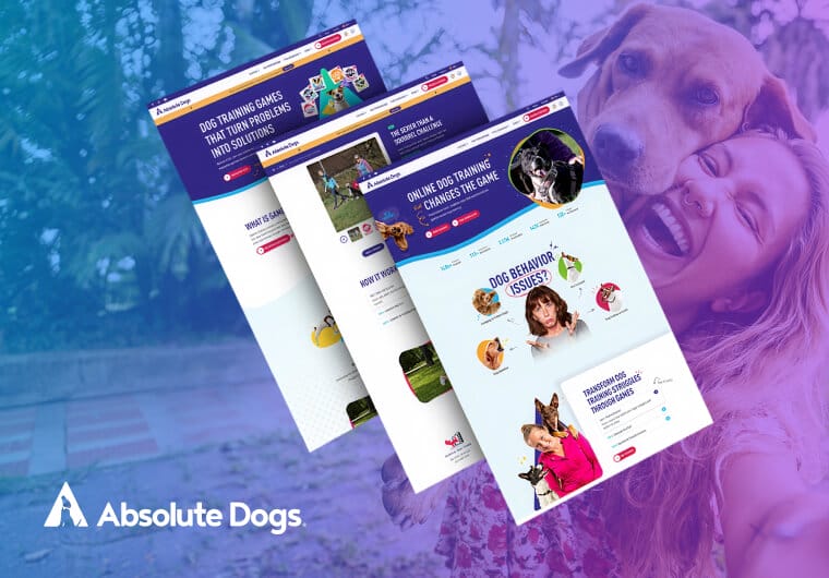
Absolute Dogs’ Organic Search Session Growth
Absolute Dogs’ custom Shopify redesign focused on clearer messaging, cleaner product organization and shopping paths built around how customers browse.
We restructured products and collections, refined key eCommerce journeys and created conversion funnels that guide users from discovery to add-to-cart action.
After launch, the site increased new users by 5.9%, organic search sessions by 32.4% and add-to-cart actions by 77.88%.
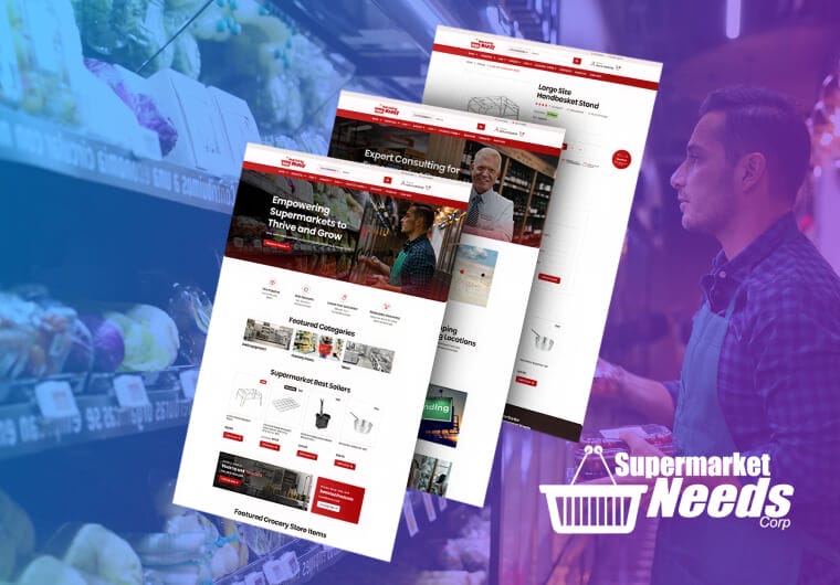
Supermarket Needs’ Dual-Audience Storefront
A decade-old storefront kept much of Supermarket Needs’ catalog hidden from search engines, buyers and everyday consumers.
Our team rebuilt the Magento experience with department-based navigation, a brand-forward homepage, buyer-focused merchandising, newsletter capture, member tools and a flexible CMS.
With an Insights hub, mobile-friendly templates and a clear path toward platform modernization, the new storefront gives Supermarket Needs a digital foundation for B2B and consumer growth.
Get The Latest Web Design
Insights Delivered To Your Inbox
Insights Delivered To Your Inbox
"*" indicates required fields
Take The Smart Road To
Digitizing your Business Growth
Start a conversation with us
"*" indicates required fields