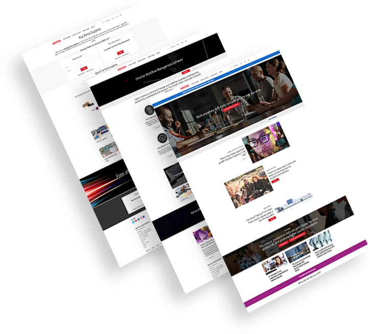
Xerox Web Marketing Case Study
Increasing Sales By 20% Through Lead Generation
-
Xerox, a global technology company, needed a new strategy to capture B2B leads for their new printer technologies.
-
We created a new landing page, paid media, retargeting and email marketing campaigns.
-
The result: 43% conversion rate for nurtured leads.
The Challenge
Xerox struggled to capture B2B leads for their new printer technologies due to a:
Weak Conversion Funnel
Xerox’s website design lacked the critical touchpoints needed to influence customers’ decisions.
Poor Lead Capturing Strategy
Xerox didn’t send leads directly to the sales force tasked with redistributing to their resellers.
Mistargeted Digital Campaign
The Xerox website and digital marketing efforts didn’t support their digital strategy and were ultimately unsuccessful in securing leads.


The Solution
We improved customer engagement, conversions through digital campaigns
and custom landing page design. Some of our deliverables included:
and custom landing page design. Some of our deliverables included:
-
Audience Reach
We built the Google Search and Display Ads campaign targeting category and branded keywords. -
Retargeting
We created a retargeting campaign through Google Ads for the most eligible users with time-on-page and video views. -
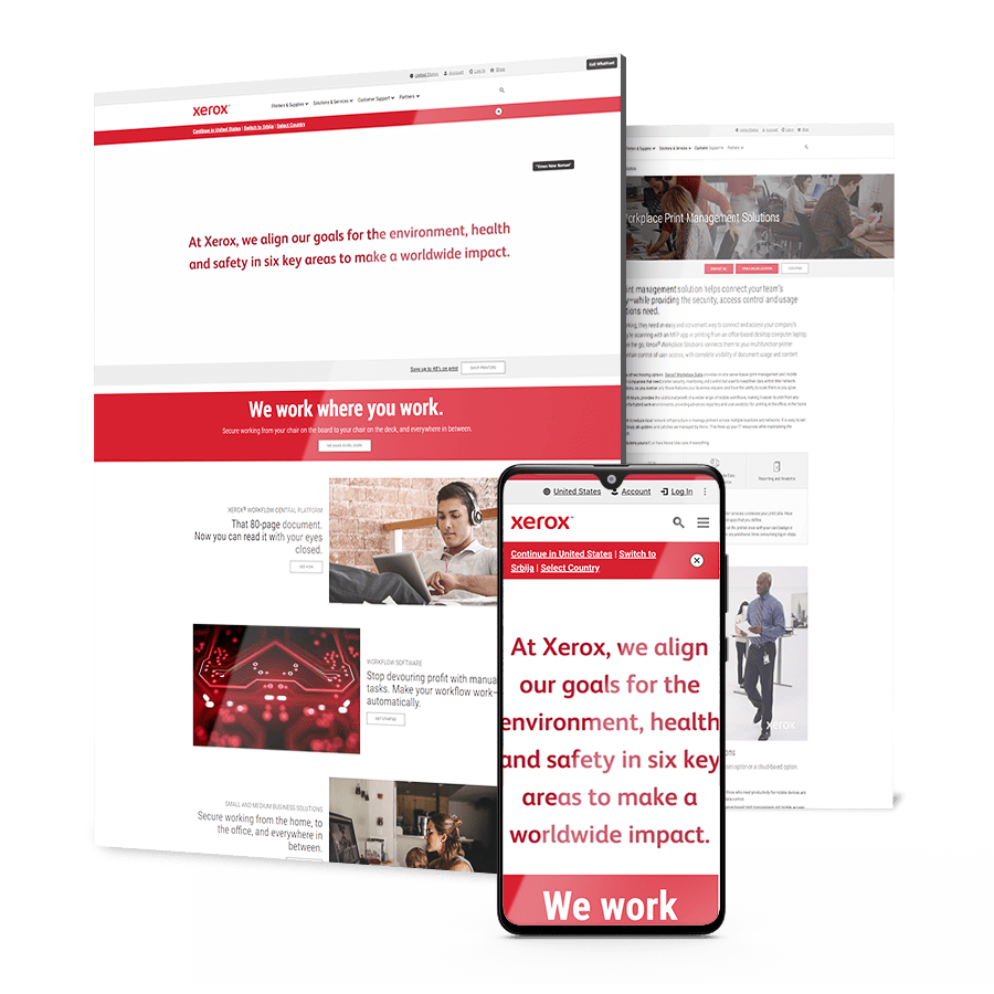
Landing Page
We created a new landing page on a new domain, with messaging based on most important buying triggers, a video presentation, a simple and easy to fill up contact form and a brochure download. -
Nurturing
We served custom content via email for users that downloaded the brochure but needed more time to make a decision.
The Results
We delivered end-to-end results
for Xerox within 6 months.
for Xerox within 6 months.
-
We increased sales by20%for Xerox Versalink by
generating and nurturing leads -
Conversion rate for nurtured leads hit43%with custom messaging and
conversion optimization strategies
Market Leadership
Trusted by Brands
That Demand More
Explore our case studies & see how we grow brands online.
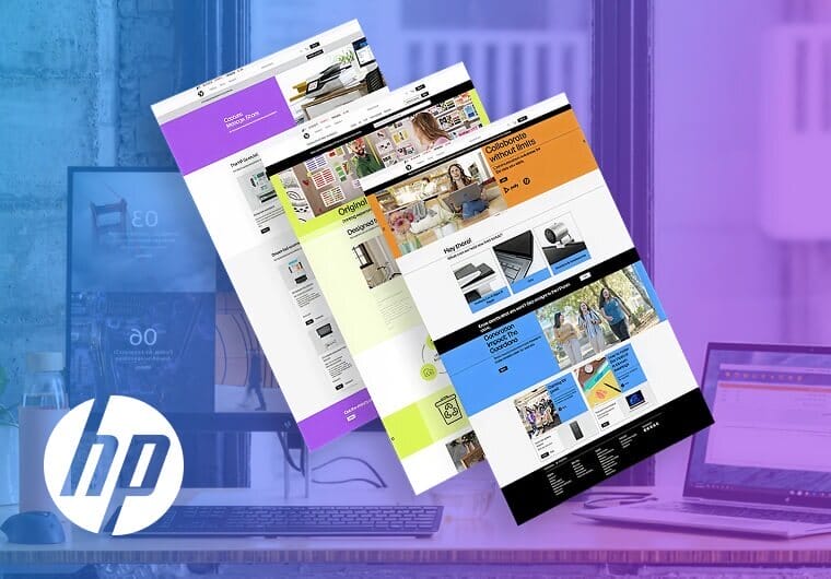
HP Driving Performance Through Data-Driven Marketing
In a competitive technology landscape, meaningful customer interactions can be a powerful differentiator.
HP sought to elevate its digital marketing efforts through campaigns designed to improve relevance, engagement and overall performance.
By combining strategic targeting with performance-driven optimization, the brand strengthened connections with its audience while maximizing the impact of its marketing investments.
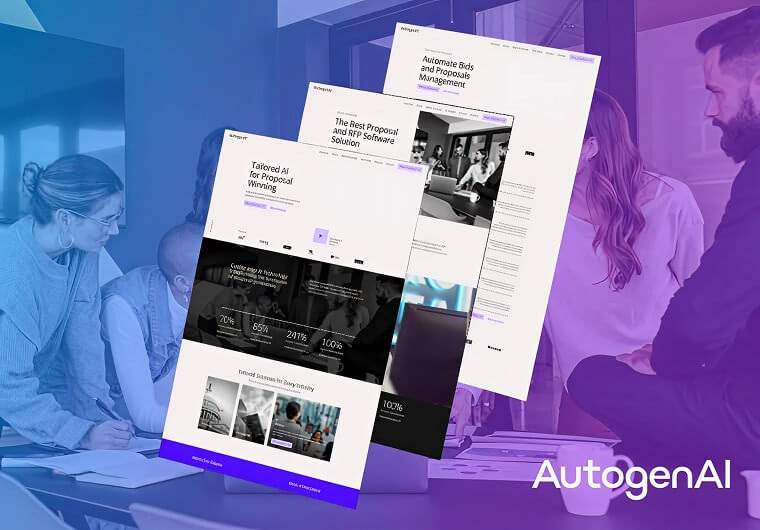
AutogenAI Bringing AI Innovation Into Focus
As demand for AI-powered solutions accelerated, AutogenAI needed a website that could clearly communicate its value, support rapid growth and reinforce its position in a competitive market.
The result is a stronger online experience that simplifies complex technology while supporting lead generation and business growth.
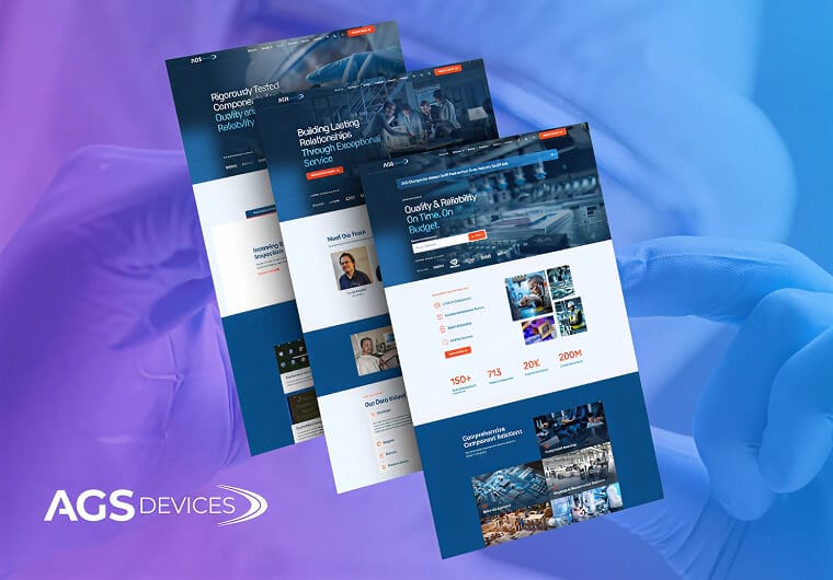
AGS Devices Making Specialized Solutions Easier To Find
In highly technical industries, reaching the right audience can be just as important as developing the right product.
AGS Devices needed a digital marketing strategy that would increase visibility among key decision-makers and create new opportunities for growth.
Through targeted campaigns, audience-focused messaging and data-driven optimization, the brand strengthened its digital presence and expanded its reach within a competitive market.
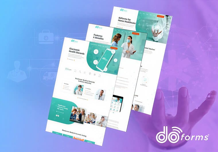
doForms Simplifying Field Data Collection For Modern Teams
For organizations that rely on field operations, access to accurate data can make all the difference.
doForms needed a digital experience that could clearly communicate the value of its mobile forms platform while helping prospective customers understand how it streamlines data collection and reporting.
Through strategic UX, refined messaging and a more intuitive website experience, the brand transformed complex functionality into a clear and engaging story.
Get The Latest Web Design
Insights Delivered To Your Inbox
Insights Delivered To Your Inbox
"*" indicates required fields
Take The Smart Road To
Digitizing your Business Growth
Start a conversation with us
"*" indicates required fields