No Sales on Shopify: 9 Reasons Your Store Isn’t Converting
No sales on Shopify despite steady traffic? Here are 9 reasons your store isn't converting and how to fix each one.


-
Nobody buys what they cannot understand. When visitors can’t tell how two of your products differ, they leave instead of asking, and you never see why.
-
Surprise costs at checkout abandon more carts than high prices do. Show shipping and delivery dates on the product page, not at the final step.
-
Not every fix pays off on the same timeline. Checkout and product page changes show up in a couple of weeks, while trust and organic traffic take months.
-
Doing everything yourself. Small Shopify sites are easy to manage, but as your business grows, so does the site’s complexity, and it’s good to get a professional involved.
You refresh the dashboard, watch the session count tick up and see the orders number sit at zero. That gap between traffic and revenue is one of the most common problems in eCommerce, and it turns up constantly on a platform that powers 19.34% of all ecommerce sites worldwide.
The maddening part is that the cause is almost never a mystery once you know where to look. Below, you will find nine reasons behind no sales on Shopify, how each one shows up in your numbers and what to change first.
9 Reasons You’re Getting No Sales On Shopify
Most of these have nothing to do with your products. They have to do with the 90 seconds between someone landing on your site and deciding they would rather not. Read them in order, because the earliest problems cost you the most shoppers and no amount of checkout tweaking saves a visitor who already gave up on your homepage.
1. Your Store Takes Longer Than Three Seconds To Load On A Phone
You test your store on a laptop, on office wifi, with everything cached. Your customer opens it on a three-year-old Android, on patchy cell service, in a parking lot. Those are two completely different websites.
Shopify themes are quick when they launch. What slows them down is everything bolted on afterwards: a reviews app, a popup app, a currency switcher, an upsell widget, a chat bubble and four tracking pixels.
Each one loads its own scripts on every page, including the two apps you stopped using in March and never uninstalled. Their code often lingers in your theme files long after the app is gone. Add one 6MB hero image nobody compressed and you have a store that takes nine seconds to show a product. Nobody waits that long for a brand they have never heard of.
How You Can Fix This
- Open your store on cell data, not wifi, and count the seconds until you can tap a product
- Uninstall every app you have not used in the past month, then check theme.liquid for code the app left behind
- Re-export product photos as WebP and keep them under 200KB each
- Cut down to one custom font family and two weights
- Track Largest Contentful Paint and Cumulative Layout Shift in Search Console instead of trusting a single speed score
- Turn off theme features you never enabled on the front end, like sliders and video backgrounds
Compressing images and cutting unused scripts are the two changes that improve page load times the most, and both are an afternoon of work rather than a rebuild.
2. Shoppers Can’t Find The Product They Came For
Your navigation makes sense to you because you wrote it. You know “The Core Range” means starter bundles and “Signature” means everything else. A first-time visitor sees two words that mean nothing, guesses, lands on a collection with four products and no filters, then leaves.
Search is where it gets painful. Shopify search only finds what your product titles and tags say. If nobody tagged the word “dress”, a shopper typing “dress” gets a blank page, and that person had the highest buying intent of anyone on your site that day. Most store owners have never once used their own search bar, so this goes unnoticed for years.
How You Can Fix This
- Name collections the way customers talk, not the way your supplier invoices you
- Keep menus to two levels so no collection is more than two taps deep
- Turn on Shopify Search & Discovery, then read the zero-result query log once a month
- Point your no-results page at bestsellers rather than an empty screen
- Show at least 12 products per collection page on desktop and 8 on mobile
- Put price, star rating and review count on collection thumbnails so people can compare without clicking into each product
- Delete filters that return nothing and test how long the rest take to apply
How you group and label pages does more for sales than most design changes, which is why website navigation deserves its own plan rather than a last-minute menu build. For larger catalogs, mega menus with images and grouped categories cut the number of taps between a visitor and the thing they want.
This was the exact situation at ZipTie, a US cable tie manufacturer we rebuilt on Shopify Plus.
Before the redesign, 87% of visitors left before reaching a single product page, and of the few who got that far, only 20% added anything to a cart.
Poor filtering and inconsistent layouts stalled every decision. Our team standardized the product grid, built filters that work and pushed more than 20 SKUs above the fold.

In the first 30 days, browse-stage drop-off fell from 87% to 68%, collection page traffic rose 572%, add-to-cart events jumped 519% and the conversion rate climbed 353%.
3. Your Product Pages Don’t Answer The Questions People Actually Have
Most product descriptions get written by someone who already knows the product inside out. So they list specs and skip the three things a stranger cares about: will this fit me, when does it arrive and what happens if I hate it.
A shopper with an unanswered question does not email you to ask. They open a new tab, check Amazon and either buy there or forget the whole thing. You never see that moment in your analytics. All you see is a product page with decent traffic and a terrible add-to-cart rate.
The other half of this is imagery. One studio shot on a white background tells nobody how big the thing is, what it looks like in daylight or how it sits on a real person. You are asking someone to spend money on a guess.
How You Can Fix This
- List every presale question your support inbox got last month and answer the top five on the page itself
- Put sizing, materials and dimensions up top, not in a collapsed tab at the bottom
- State the return window and a delivery date estimate on the product page, not just in the footer
- Show the product in use, at scale and from several angles, with zoom on every image
- Add a short product-specific FAQ block using Shopify metafields
- Switch on photo reviews so shoppers see the product in someone else’s hands
When we rebuilt the Shopify store for Buddha Brands, a plant-based snack and drink brand sold in over 5,000 retail locations, the catalog had outgrown the structure holding it and shoppers could not work out which product suited them.

Our team reorganized the range around what customers were actually after, then moved ingredients and nutritional information to the top of every product page to match the transparency already on the packaging.
4. Nobody Can Tell What You Sell Or Why They Should Buy It From You
Five seconds on your homepage should tell a stranger what you sell, who it suits and what to tap next. Plenty of stores fail that test because the homepage carries three rotating banners, a countdown timer, a loyalty widget, a video and a chat bubble, all shouting at the same volume. When everything is urgent, nothing is.
There is a harder version of this problem, and it has nothing to do with layout. If your product also sells on Amazon and your page says the same things the Amazon listing says, you have given nobody a reason to buy from you instead. Same photos, same spec list, same price, less trust. You will lose that comparison every time.
The same goes for stores selling something unfamiliar. If a visitor cannot tell what the product does or how it differs from the cheap version they already own, they do not buy and they do not ask.
How You Can Fix This
- Show your homepage to someone who has never seen it for five seconds, then ask what you sell and what they would click
- Cut to one promotional banner and one primary button above the fold
- Say what the product does for the buyer in the first line of the page
- Give people a reason to buy direct: a bundle, a longer warranty, a better price or a trial that marketplaces cannot match
- Write button copy that names the action, like “Get my starter kit” instead of “Shop now”
- Build one page that explains the product properly and link to it from the nav, especially for anything new to the market
Absolute Dogs, a worldwide dog training brand, came to us with a noticeable version of this.
Visitors couldn’t tell which courses existed, how a one-off course differed from a membership or what either included. Their old WordPress site also made checkout and upgrades harder than they had to be.
We moved the business onto Shopify, rebuilt the conversion funnels around how people actually shop for dog training and reorganized courses by skill level and goal.
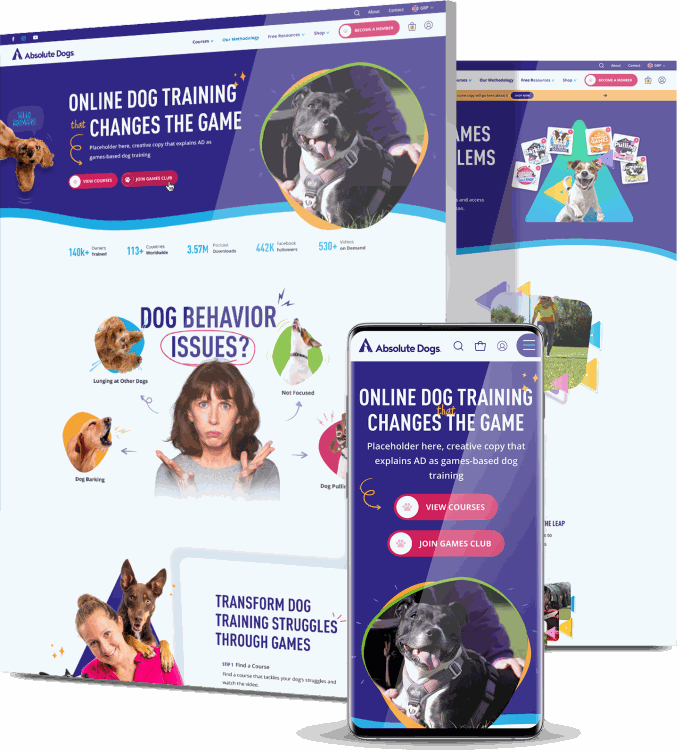
In the first month, add-to-cart actions rose 77.88% and completed purchases rose 35.63%.
5. Your Shipping Cost Only Appears At Checkout
Shopify shows shipping and tax at the checkout step by default. So a shopper builds a $42 cart, fills in their address, watches $14 of shipping land on top and closes the tab. It is the single most common reason carts get abandoned anywhere online, and the money is not really the point. Being surprised by it at the last step is the point.
Delivery timing does the same damage. “Ships in 5 to 7 business days” does not answer the question someone buying a birthday present is asking, which is whether it arrives before Saturday. When people cannot tell, they assume the worst and buy elsewhere.
How You Can Fix This
- Put your shipping rate or free shipping threshold in the announcement bar and on the product page
- Show an estimated delivery date range, not just a processing time
- Set a free shipping threshold you can afford, then show a progress bar toward it in the cart
- Fold shipping into the product price if your margins allow, then advertise free delivery properly
- Auto-apply discount codes rather than asking people to hunt for them
- Let people see the full total before they hand over personal details

6. Your Store Hasn’t Given Anyone A Reason To Trust It
Every first-time visitor runs a quick risk check, mostly without thinking about it. Is this a real company. Will the parcel turn up. Can I get my money back. No reviews, no photos of actual customers, no phone number, a stock-photo about page and a returns policy copied from a template all feed the same conclusion.
Any one of those on its own is survivable. Together they add up to a store that might not ship anything at all, and people would rather pay more somewhere familiar than gamble $60 on a domain they have never seen.
Fake-looking reviews do more harm than none. 40 five-star reviews posted the same week, one sentence each, no photos, no dates. Shoppers spot that pattern instantly, and now they have an active reason to doubt you rather than a neutral one.
How You Can Fix This
- Ask your first 50 customers for reviews with photos, then show them on product pages and the homepage
- Put a working phone number, email and business address in the footer
- Rewrite your returns policy in plain language and link it next to the add-to-cart button
- Reply publicly to negative reviews instead of hiding them
- Show payment logos and a short security note at the payment step
- Post real customer content on Instagram or TikTok, since plenty of people search your brand there before buying
It helps to look at how established stores handle this, since the best eCommerce websites make trust visible at the moments people hesitate rather than burying it on an about page.
7. You’re Paying To Bring In People Who Were Never Going To Buy
Sessions climb, conversions don’t, and everyone assumes the store is broken. Sometimes the store is fine and the traffic was junk. Campaigns optimized for clicks instead of purchases. Broad audiences with no exclusions.
Placements where people tap an ad by accident inside a mobile game. An ad promising 40% off that drops visitors on a homepage where no discount exists.
Bad traffic does more than waste budget. It inflates your session count, drags your conversion rate down and pollutes the data you would use to diagnose anything else. You end up debugging a checkout that works fine, because the numbers pointed you there.
The search version of this is subtler. Ranking for “best running shoes” brings browsers. Ranking for “running shoes for flat feet under $120” brings buyers. One of those keywords looks better in a report and the other pays your bills.
How You Can Fix This
- Switch campaigns to a purchase objective and cut low-quality placements
- Send every ad to the exact product or collection shown in the creative, never the homepage
- Match the headline, price and image on the landing page to the ad that earned the click
- Compare conversion rate by channel and device in Shopify rather than judging one blended average
- Chase longer, more specific search terms with obvious buying intent
- Check your paid traffic bounce rate against organic, since a big gap usually means targeting rather than design
8. You Collect Emails And Then Do Nothing With Them
The popup fires, someone hands over an email for 10% off, and then silence for six weeks until you remember to send a newsletter. Meanwhile around seven in ten carts get abandoned with nobody following up.
Most store owners treat their list like a chore. It is the cheapest revenue you own, and it is the only audience you do not pay a platform to reach twice. First purchases rarely happen on the first visit either, particularly above $50, so the follow-up is often where the sale actually happens.
One more thing worth checking: if your welcome discount arrives by email, you just sent a ready-to-buy shopper into their inbox. Plenty of them never come back.
How You Can Fix This
- Build a three-email abandoned cart flow: a reminder within the hour, a nudge at 24 hours, an incentive at 72
- Show the welcome code inside the popup rather than emailing it
- Add a browse abandonment flow for people who viewed a product and left without adding it
- Segment by what people looked at, not by when they subscribed
- Send a post-purchase flow that asks for a photo review and suggests one related product
- Delay your popup to 20 seconds or exit intent so it fires after someone has seen something worth buying
G Pen, a vaporizer brand whose Shopify catalog spans very different products and audiences, had the opposite problem of most stores.
One message could never cover the whole range. Our team refined the site funnel, then built segmented campaigns in Klaviyo around specific products and customer groups, supported by SMS and push flows.

Return on marketing spend came in at 4,300% on Klaviyo and 31,500% on SMS.
9. Something In Your Checkout Is Broken And Nobody Told You
Nobody emails to say the payment step failed. They leave, and you never hear about it. This is the reason that catches out stores with good products, good traffic and good-looking pages.
Shopify’s checkout itself works. What breaks is everything around it. A discount code that expired months ago but still sits in your hero banner. A shipping zone that excludes half a country, so certain postcodes hit “no shipping methods available” and give up.
A size selector that gives no visual feedback when tapped, so shoppers cannot tell if their choice registered. A mandatory field hidden under the mobile keyboard. A subscription app that quietly adds a recurring charge the customer didn’t pick.
All of it is invisible from the admin panel and obvious within 60 seconds of trying to buy something yourself.
How You Can Fix This
- Buy something from your own store once a month, on your phone, with a real card, then refund yourself
- Test every payment method you offer, including Shop Pay, PayPal, Apple Pay and Google Pay
- Check that your shipping zones cover every region your ads run in
- Give variant buttons a visible selected state and show an error when someone skips a choice
- Let people change quantity or remove an item from the cart without starting over
- Turn on guest checkout so nobody has to make an account to spend money
- Confirm your conversion tracking fires, because a store with “no sales” occasionally has sales it never recorded

How To Tell Which Problem Is Killing Your Sales
Nine problems is a lot to take on at once, and you do not have to. Your own data will point at the one costing you the most, usually within an hour of looking properly. Here is the order we work through it.
1. Find Your Biggest Drop-Off In Shopify Analytics
Open your conversion funnel in Shopify analytics. It shows five steps: sessions, product views, add to cart, reached checkout and converted. Look for the largest percentage fall between any two of them, because that is where your money leaks out.
Under 30% of sessions reaching a product page points at your homepage, navigation or traffic quality. Plenty of product views with few add to carts points at your product pages. A healthy add-to-cart rate with a collapse before checkout usually means shipping costs or trust. Lots of people reaching checkout and few finishing means the checkout mechanics themselves.
2. Buy Something From Your Own Store On Your Phone
Not a preview. A real purchase, on cell data, with a real card, from a fresh browser where you are not logged in. Time it. Note every point where you pause, squint or scroll back up.
Then hand your phone to someone who has never seen the store and ask them to buy a specific product without any help. Watching someone else get stuck for eight seconds on a menu tells you more than a week of heatmaps. You are far too close to your own store to see it properly.
3. Read Your Search Logs And Your Support Inbox
Two free sources of truth that most owners ignore. Zero-result searches in Shopify Search & Discovery tell you exactly what people wanted and could not find, either because you do not stock it or because nobody tagged it.
Your presale emails are the other half. Every question someone bothered to send you is a question a hundred other shoppers had and did not bother to ask. Those belong on the product page.
4. Compare Your Numbers Against A Real Benchmark
Most eCommerce stores convert somewhere between 1% and 3%, so if you get 400 sessions a month, a single order is roughly on track and not evidence of a broken site. Judge yourself by device and channel instead of one blended figure. Mobile converting at a third of your desktop rate is a mobile problem, not a pricing one.
Competition matters here too. The number of Shopify stores grew 7.3% quarter-over-quarter in Q2 2026, which means more brands are bidding on the same keywords and chasing the same shoppers than last year.
A conversion rate that held flat while your category got busier is not really flat.
5. Ask The People Who Didn’t Buy
Add a one-question exit survey: “What stopped you buying today?” Most people ignore it. The ones who answer hand you the exact reason, in their own words, for free.
You can also email subscribers who never ordered and ask the same thing. Offer nothing in return and you will still get replies, because people like being asked.

How Long Before You Start Seeing Sales
Checkout and product page fixes move fastest, because the traffic is already there. Turning on guest checkout, showing shipping earlier, fixing a variant selector that gives no feedback: those show up in your numbers within days. Give it two to three weeks before you trust the result, and longer if you get fewer than 1,000 sessions a month, since small samples lie.
Speed, navigation and site structure sit in the middle. Expect two to six weeks for the conversion side, then a second lift later as search engines recrawl and your collection pages start pulling their own traffic.
It’s the same with email flows. An abandoned cart sequence pays off in the first two weeks, while a properly segmented program takes a couple of months to build up.
Anything tied to organic traffic or brand trust runs on a longer clock. SEO content, review volume, repeat customers and people recognizing your name take three to six months, sometimes more in a crowded category.
So if you swapped your theme yesterday and still have no orders this morning, nothing has gone wrong. Fix the fast things first so you have revenue coming in while the slow things build.
Improve Your Shopify Sales With Digital Silk
We rebuild Shopify and Shopify Plus stores around how people actually shop, then keep working on them after launch.
That covers the whole path a customer takes: navigation and product discovery, product page content, checkout flows, speed on real devices, plus the SEO and email work that brings people back.
Our team has taken a B2B store from 87% browse-stage drop-off to 68% and a 353% conversion lift in 30 days, and moved a global training brand off WordPress onto Shopify for a 77.88% rise in add-to-cart actions.
Every project starts with a strategist who digs into your data before anyone touches a design file, because the fix depends entirely on where you are losing people.
Contact our team, call us today at (800) 206-9413 or fill in the Request a Quote form below to tell us about your project and start your eCommerce project today.
No Sales On Shopify FAQs
How much traffic do I need before zero sales is actually a problem?
Around 1,000 sessions. Below that, you are working with numbers too small to mean anything, since a 2% conversion rate on 300 visits predicts six orders and could easily give you none.
Under 1,000 sessions a month, treat traffic as your first job. Above it with zero orders, something on the site is stopping people.
What conversion rate should a Shopify store aim for?
Most stores land between 1% and 3%, though it swings hard by category and price point. Cheap consumables convert higher, considered purchases over $200 convert lower.
The more useful number is your own trend, split by device and traffic source. A 0.4% rate on paid social alongside 2.8% on organic search points at the ads, not the store.
Why do I get add-to-carts but no completed purchases?
That pattern almost always means cost or trust at the final step. Shipping and tax appearing for the first time at checkout is the usual culprit, followed by a forced account signup, too few payment methods or a shipping zone that excludes the customer.
Walk the full path yourself on mobile and the break usually shows up in the first attempt.
Can my Shopify theme really be the reason I get no sales?
Rarely on its own. Themes cause problems when they load slowly, hide the add-to-cart button below a wall of text on mobile, or lack the product page elements your category expects, like size guides or comparison tables.
Before you buy a new theme, check whether the issue is actually apps, images or content. Switching themes resets nothing else.
How many Shopify apps are too many?
There is no hard number, but each app can load its own scripts on every page. A practical rule: if you cannot say what an app does for your revenue, uninstall it.
Then check your theme files, since removed apps often leave code behind. Stores carrying 25 apps usually need about eight.
Do I need a headless setup to personalize a B2B store?
No. Plenty of suppliers run effective personalization on standard platforms using native segmentation, custom price lists and account-level catalogs.
Headless architecture helps when you have complex order forms, multi-level permissions or deep integrations across several systems. Treat it as a response to genuine complexity rather than a default choice, because it raises both build cost and maintenance load.
Do I need reviews before I can get my first sale?
No, but you need something doing the same job. Detailed photos, a visible returns policy, a real contact number, press mentions or founder content all lower perceived risk.
Send free product to 20 people in exchange for honest photo reviews and you close the gap in a few weeks. Zero social proof plus zero brand recognition is a hard combination.
Does offering free shipping actually increase sales?
Usually yes, because surprise costs at checkout drive more abandonment than the price itself. The catch is margin.
A threshold like free shipping over $75 often works better than free shipping on everything, since it protects your economics and nudges order values up. Whatever you pick, say it on the product page rather than at the final step.
How do I know if my traffic is real or bot traffic?
Look for sessions with a near-zero duration, no scroll depth and odd geography compared to where you sell. Bot traffic usually spikes overnight and lands on one page.
Compare Shopify analytics against Google Analytics, since large unexplained gaps often mean junk sessions. Real traffic that never converts is a different problem to fake traffic, and the fixes have nothing in common.
Should I fix the website or the marketing first?
Fix the site first if people arrive and leave without viewing products, since more traffic into a leaking store just costs more.
Fix marketing first if visitors browse deeply, add to cart and still do not buy in numbers that suggest the wrong audience. Your funnel report tells you which, and it takes about ten minutes to read.
Tell us about your website goals and let our experts give you a custom proposal
"*" indicates required fields